

Travel Agency UX Design
UX Design + UI Design + Creative Strategy
Redesigning the customer experience for a travel agency transitioning from in-person to digital booking while providing a bespoke touch.
Role + Responsibilities:
User Research, Competitive Analysis, Wireframing, Prototyping, Light Branding
Team Structure:
1 Senior Designer + 1 Project Manager + 3–5 Consultants
Project Timeline:
6 weeks
The context:
Our client’s business was recovering from the massive impact that COVID-19 had on the travel industry and decided to seize the opportunity to rethink their booking process. Nearly overnight, the agency needed to shift their business model, which was historically based on funnelling users into physical consultations with agents. This was obviously no longer feasible in the new environment.
The goal:
Our goal was to provide a way for clients to still book trips with the agency once travel opened back up, while still preserving the bespoke touch that set them apart pre-pandemic.
Please note: This project was completed under an NDA. Logos, photography, and brand colours have been changed to retain client confidentiality, but the design process is unchanged.Research
Findings
2.
More and more users are making travel bookings online. 82% of users are making their bookings online, leading experts to estimate 700 million people making bookings online by 20233.
3.
Users are booking 62.5% of their trips on desktop and 37.5% on mobile, a 3% increase in mobile bookings from 2021.4 This shows that mobile booking is the future, particularly for younger users.
4.
Millennials who value convenience are moving away from a DIY booking process and gaining interest in more bespoke solutions. 34% are happy to book trips with an agent, and 60% are happy to pay more for expertise3.
5.
In the global travel and tourism market, users are doing the majority of their spending online, with a 68% revenue share of online sales5.
These findings, based on demographic information provided by the client, helped to validate that our client could fill an important niche in the market, fulfilling customers’ desires for a simpler booking experience while also offering the help of an expert wherever and whenever they needed it. We then began some competitor analysis, looking at six similar brands and specifically at the booking flow in their mobile app.
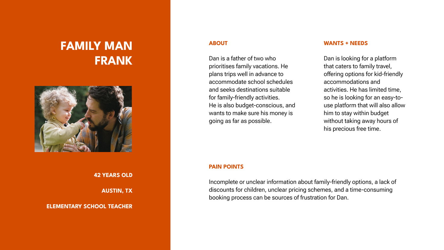
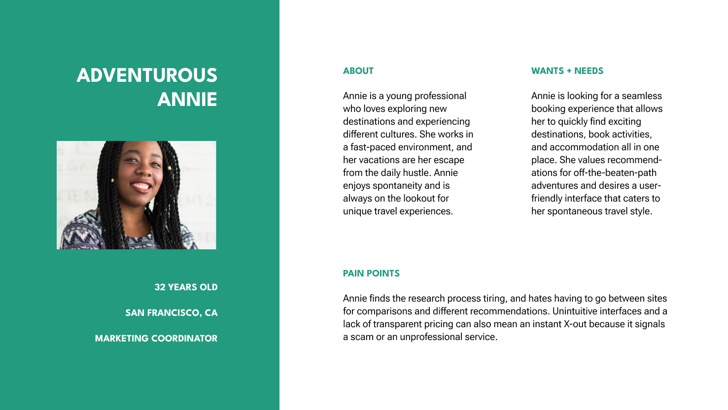
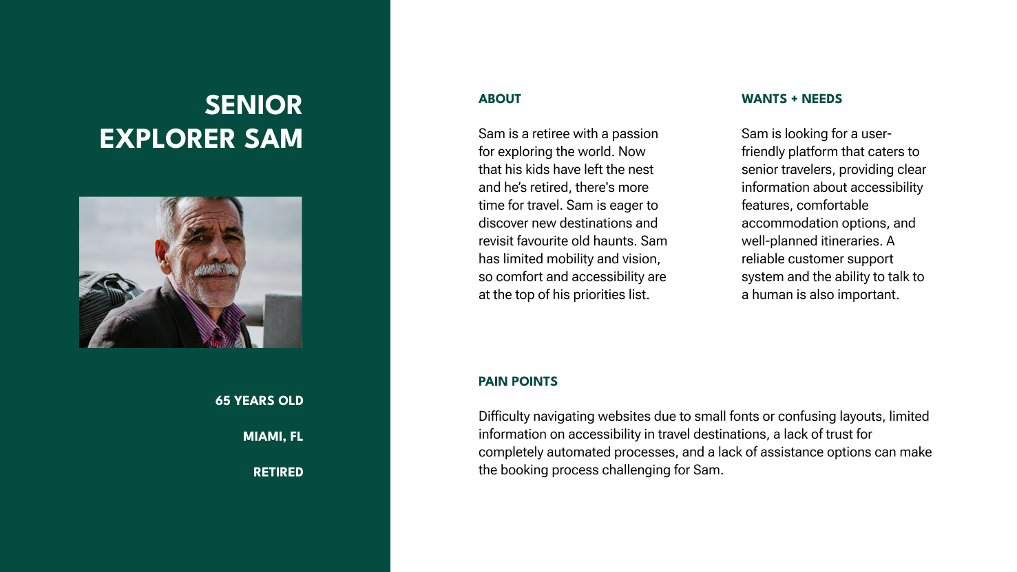
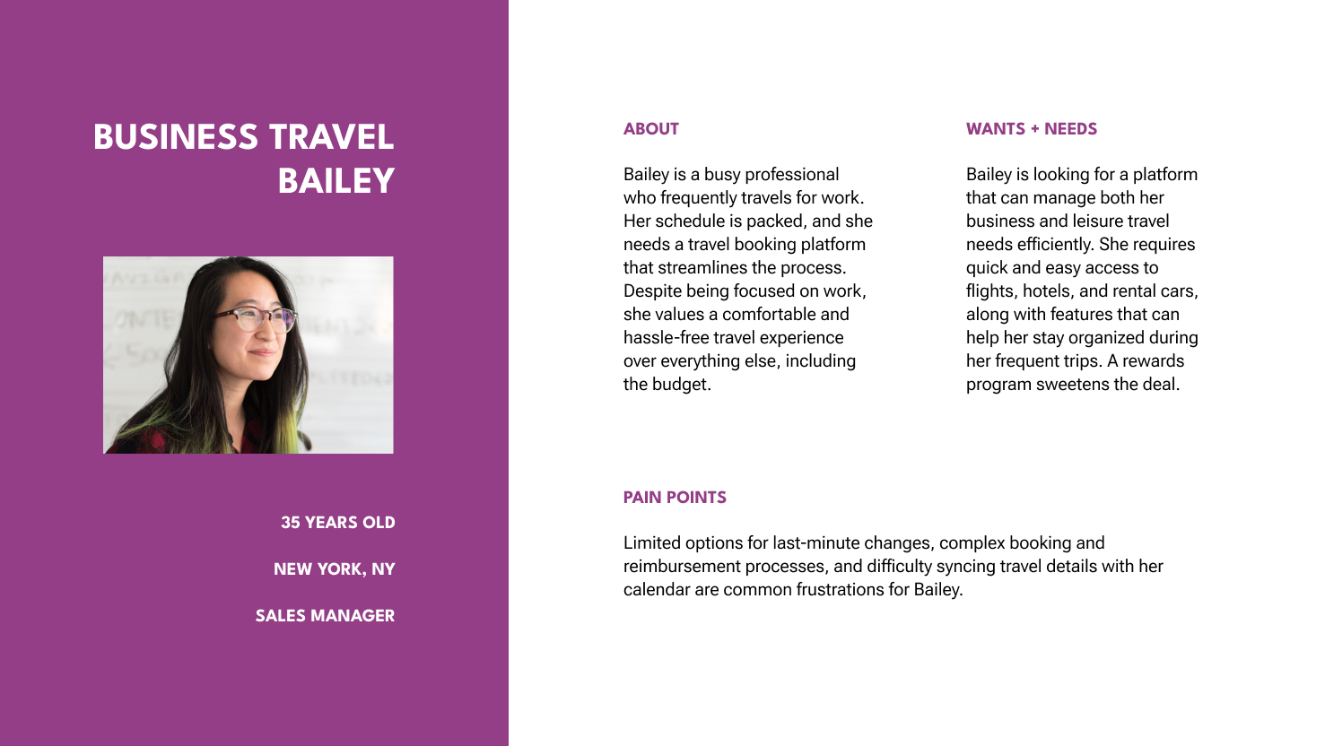
We defined four personas around this research: Adventurous Annie, Senior Explorer Sam, Family Man Frank, and Business Travel Bailey.
User Flows
We took these personas and matched each one to a specific user flow that would be required for an MVP. We created low-fidelity wireframes for each flow, which were tested in small groups and iterated upon. Unfortunately I no longer have access to previous iterations of the flows.
Flow 1.1 — Self-led hotel booking
Family Man Frank books a trip to Athens using the app. Check-out process is not included in this sprint.
Flow 1.2 — Self-led experiences booking
Adventurous Annie has already booked her trip, and is looking for experiences and tours for her to take part in during her trip.
Flow 2.1 — Agent consultation booking
Senior Explorer Sam begins his booking journey by speaking with an agent, choosing what level of support he wants from them.
Flow 2.2 — Agent experiences booking
Business Travel Bailey has already booked her travel with an agent. She messages her agent to ask for suggestions on what to do over the weekend.
Iteration
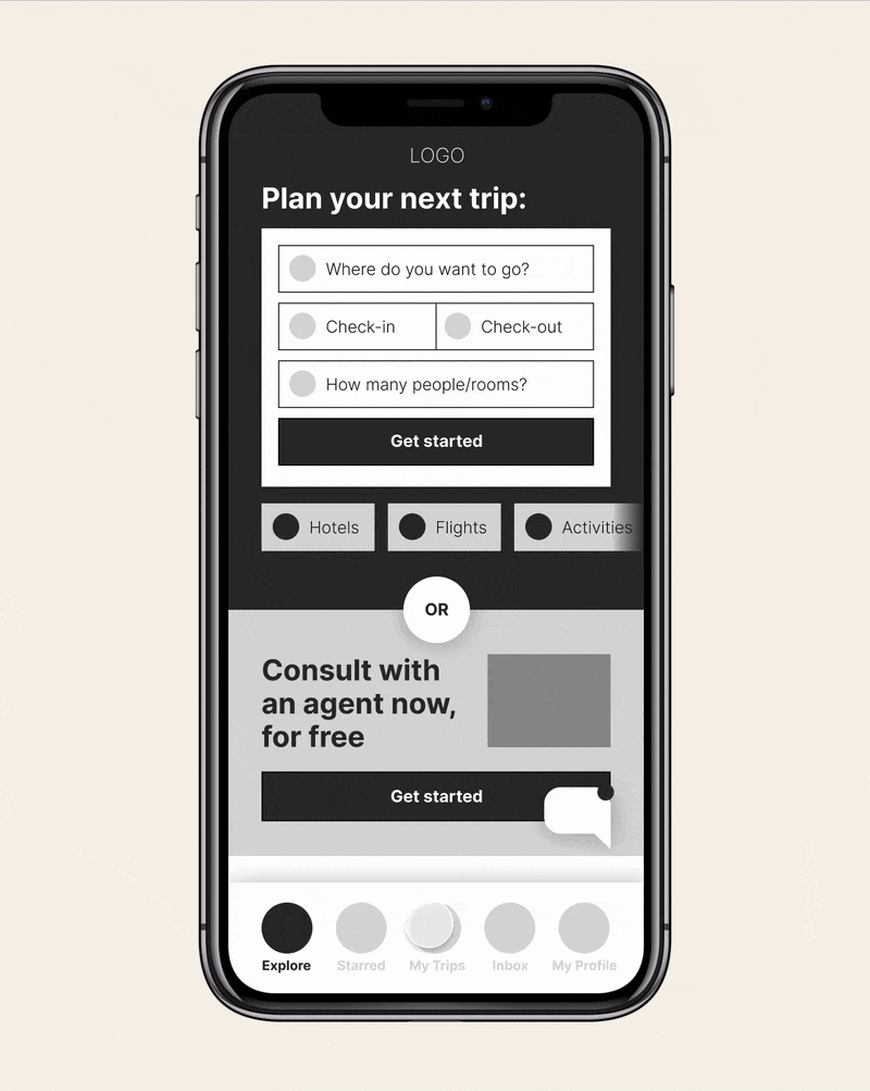
This project involved a significant amount of iteration, particularly regarding the home screen. Our client wanted to balance the opportunity for customers to book their own travel and experiences with the bespoke experience of working with an agent. Our first version placed more priority on a self-led booking flow, and we went through several iteration cycles to land on the “or” mechanic we ended up using. We also began to use accessiblity checker tools more regularly.
By the time we had moved on to a high-fidelity prototype, we had chosen a look and feel that involved a number of circles and lines, and adapted many of the UI elements to retain that look and feel to keep consistency.
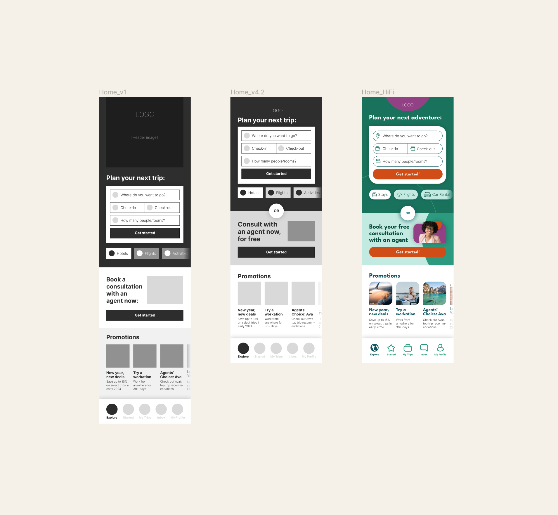
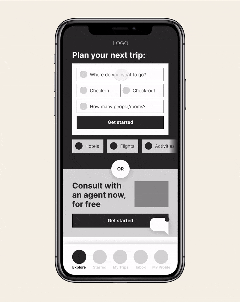
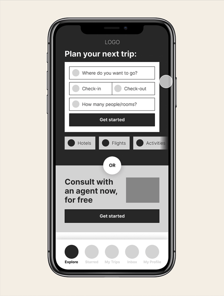
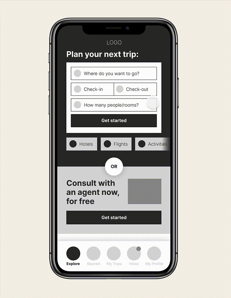
High-Fidelity Wireframes
Once we were happy with these flows, we moved on to more high-fidelity prototyping. I was able to establish a number of guidelines and standards, as well as a desktop view of the homepage. The look and feel has been altered here to preserve client confidentiality, but my goal for this look and feel were to create something user-friendly and eye-catching. I frequently used rectangles with only one edge left pointed to resemble a chat bubble, so as to carry through the theme of there always being an agent behind each choice, eager to help customers plan the trip of your dreams.

Reflections
This was one of the first projects I was able to work on that really followed the double diamond approach, rather than just jumping directly into prototyping. I really appreciated the ability to be a part of the research process and to speak directly to the client about their goals and priorities.
I was very pleased with my work here, particularly in how much we accomplished within a very short span of time. We went through many iteration cycles that aren’t possible to show here, and I became comfortable serving as something of the nexus of the project, negotiating the client priorities with our strategic approach, tight timelines, and of course the end user in mind.
If I had a chance to revisit this project, I would be eager to run some user tests on our prototype to actually collect some data on usability. I would also like to go through and check more thoroughly for accessibility issues.